There seems to be some contention about the Zorn palette and whether or not he actually used it. But the so-called Zorn palette is named after the
Anders Zorn, that much is true. It's also known as limited palette, but either way it's comprised of four colours: a low-chroma yellow (e.g. yellow ochre, yellow brown), a black - acting as a low-chroma blue, a high-chroma red (e.g. terra rosa, English red, vermillion) and a white. (And as mentioned, it is
disputed that Zorn only used these colours.)
Self Portrait by Anders Zorn
(From Wikipedia)
There is a pretty useful colour mixing exercise based on the palette which can be seen here on
Michael Lynn Adams' website. He said he developed it from a Richard Schmid colour exercise. This is my attempt at it:
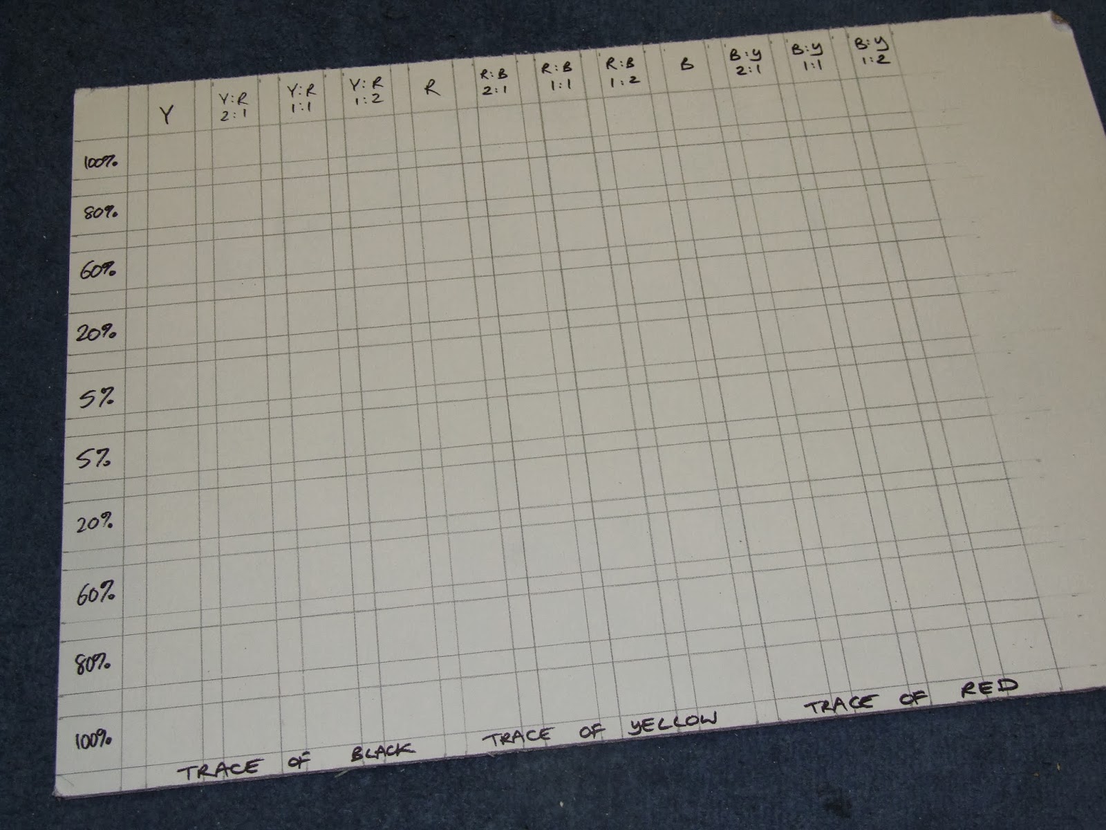
Step 1: draw the 12 x 10 square grid.
The very top and bottom rows of 12 squares are for various yellow, red and black mixes. The 10 squares on the side are for the same colours mixed with different quantities of white.
The top row of 12 is specifically for:
- yellow
- 2 parts yellow to 1 part red
- 1 part yellow to 1 part red
- 1 part yellow to 2 parts red
- red
- 2 parts red to 1 part black
- 1 part red to 1 part black
- 1 part red to 2 parts black
- black
- 2 parts black to 1 part yellow
- 1 part black to 1 part yellow
- 1 part black to 2 parts yellow
The very bottom row is for:
- yellow with a trace of black
- 2 parts yellow to 1 part red with a trace of black
- 1 part yellow to 1 part red with a trace of black
- 1 part yellow to 2 parts red with a trace of black
- red with a trace of yellow
- 2 parts red to 1 part black with a trace of yellow
- 1 part red to 1 part black with a trace of yellow
- 1 part red to 2 parts black with a trace of yellow
- black with a trace of red
- 2 parts black to 1 part yellow with a trace of red
- 1 part black to 1 part yellow with a trace of red
- 1 part black to 2 parts yellow with a trace of red
The row down the side gradually adds white to these mixes.
Row 2 is an 80% mix with 20% white
Row 3 is a 60% mix with 40% white
Row 4 is a 20% mix with 80% white and
Row 5 is 5% mix with 95% white
That is then repeated from the bottom up with the trace mixes.
The colours I used were (from left) Old Holland ivory black, Sennelier Chinese vermillion, Michael Harding yellow ochre and Old Holland titanium white.
Step 2: I considered first painting the first row of colours with no white (the top row) and then work down the whole row, like this:
But in fact it's much easier to mix a pile of a top row colour, paint the top square. Then add the trace and paint the bottom square. Then add the white for the first top square with white (80%). Then add the trace and paint the first bottom square with white and so on, gradually working into the centre:
The final result:
It's very difficult to make the ratio of each mix the same and it's clear some are very much darker or lighter than they should be. As Michael Lynn Adams says, keeping your palette very clean is a must.