Saturday, 31 May 2014

Photos from the Jordan Sokol demo at FAA, Sweden

Can't believe it's been a week already since Jordan Sokol did a two-day portrait demo at the Florence Academy of Art, Sweden, which I attended. (I will just get these photos up and add some commentary later.)

Day 1 (24/5/14)

Setting up.
Jordan recommended spending a long-time setting up and even to include this into the cost of your model-cost considerations. The panel was primed birch plywood. Discussing this choice later inspired an interesting and lengthy (and very nerdy) conversation about materials and the longevity of paintings. 

"Lower your expectations, please!"


Beginning of the block-in.
During the block-in stage Jordan discussed the various online sources for quality information on materials, and artists who are worth reading or listening to about the subject. These included the suggested donation podcastRalph Meyer of course, Ted Minoff, George O'Hanlon of natural pigments and the National Gallery bulletin amongst others. The artist Dan Thompson also came up in reference to drawing.

Further progress in the block-in
"Draw first - measure second." A comment I found valuable.


Some white beginning to be added to the block-in.
The attendees were very keen to ask about the choice of colours used once they were added to the palette. The white was a lead white from Natural Pigments. Jordan used this to both begin on a skin-tone and to correct and refine drawing. Drawing at this stage was kept abstract.  


Beginning of the colour-value block-in. 

Working from the middle values out to the darker and lighter ones.
Hog bristle brushes can be used to cover large areas quickly. Mongoose bristle brushes were also cited as a further choice for their delicate yet stiff quality.


The 5 colour-value palette for colour block-in.
Amongst others Holbein Vermillion and Williamsburg Cadmium Red Vermilion were used. 

The end of the first day's work

Another portrait Jordan had brought to show as part of the demo.
Again, unfortunately a lot of the colours, shapes and edges are lost in the photograph.
________________________________________________________________________________

Day 2 (25/5/14)
A retouch varnish can be applied to a dry-to-the-touch painting in order to begin working on it again. The shapes are worked on taking them from an abstract, or perceptual, to a more conceptual form - meaning the shapes - as they are understood as well as are observed - are considered in design. In going towards this more conceptual design the advice was given to draw what you see - not what you know - but know what to look for.


In the discussion on painting Jordan mentioned a quote from Philip Guston which reads "When you're in the studio painting, there are a lot of people in there with you - your teachers, friends, painters from history, critics... and one by one if you're really painting, they walk out. And if you're really painting YOU walk out."


Some pinks and purples and greys are not as apparent in this photograph as they were in the actual painting unfortunately.


Final result on Day 2 
(Thanks to Stephanie for these pics!)
detail


Monday, 26 May 2014

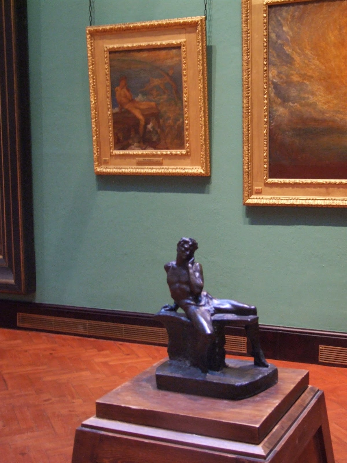
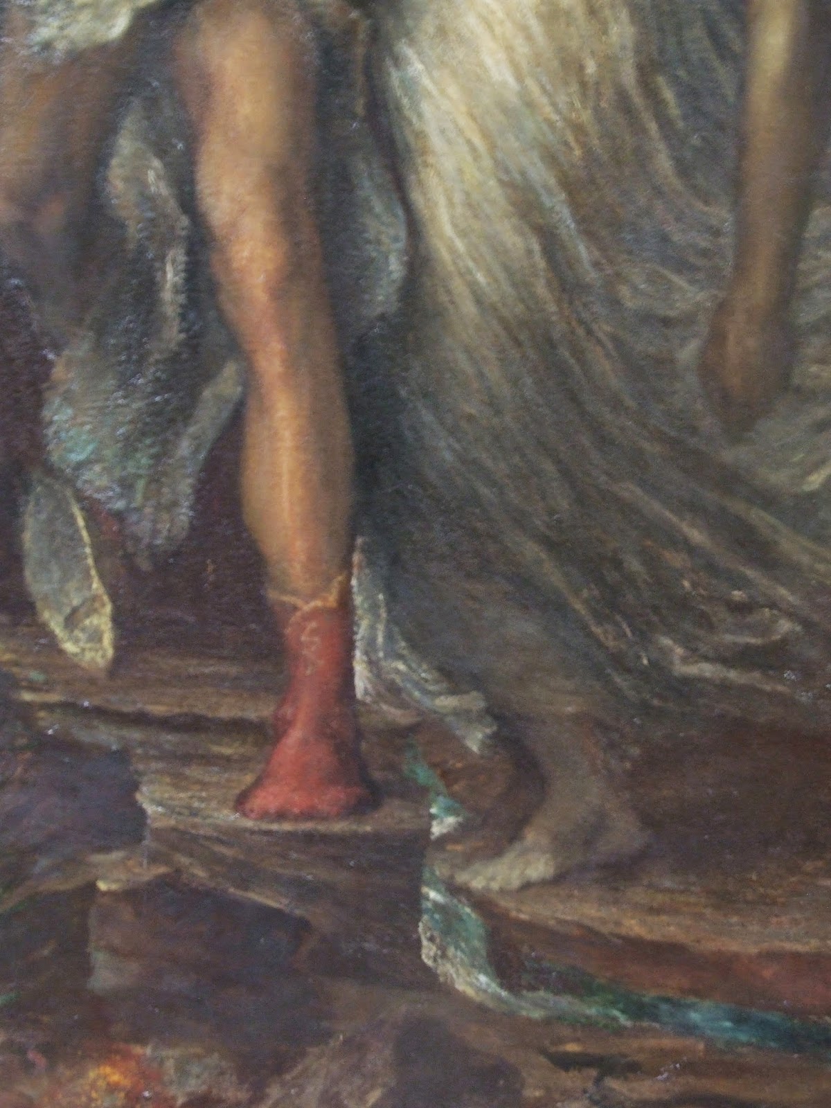
Straight Outta Compton (Surrey) - The Watt's Gallery

Photos from my visit to the Watts Gallery this weekend. Anyone who has even a passing interest in Symbolist or Victorian painters has to pay this place a visit. Watts was hugely popular in his day but is somewhat forgotten now. The Watt's Gallery is helping to right this wrong with their beautiful restoration of the gallery and amazing paintings. The gallery staff were really helpful and friendly. And very easy to get to from London (30 minutes or so from Waterloo station to Guildford, then 10 minutes on the no. 46 bus direct to the gallery). Highly recommended.


(More to follow...)

Wednesday, 23 April 2014

Workshop at Kennedy's Art Harcourt St. Sat 14th June

There's going to be another oil painting the figure workshop at Kennedy's Art Harcourt St on Saturday the 14th of June. This time we will have a male model for a change. Looking forward to seeing you all there again.


Some of you were asking about the Munsell book that is online for free. You can download it here. Enjoy!

Sunday, 2 March 2014

Michael Lynn Adams' "Zorn palette" mixing exercise

There seems to be some contention about the Zorn palette and whether or not he actually used it. But the so-called Zorn palette is named after the Anders Zorn, that much is true. It's also known as limited palette, but either way it's comprised of four colours: a low-chroma yellow (e.g. yellow ochre, yellow brown), a black - acting as a low-chroma blue, a high-chroma red (e.g. terra rosa, English red, vermillion) and a white. (And as mentioned, it is disputed that Zorn only used these colours.)

Self Portrait by Anders Zorn
(From Wikipedia)
There is a pretty useful colour mixing exercise based on the palette which can be seen here on Michael Lynn Adams' website. He said he developed it from a Richard Schmid colour exercise. This is my attempt at it:
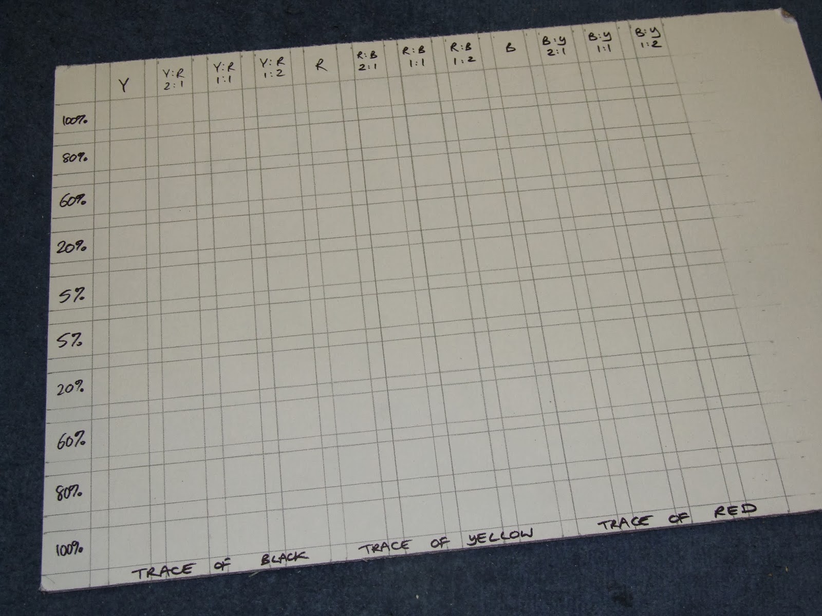
Step 1: draw the 12 x 10 square grid. 


The very top and bottom rows of 12 squares are for various yellow, red and black mixes. The 10 squares on the side are for the same colours mixed with different quantities of white. 
The top row of 12 is specifically for:
  1. yellow 
  2. 2 parts yellow to 1 part red 
  3. 1 part yellow to 1 part red 
  4. 1 part yellow to 2 parts red 
  5. red 
  6. 2 parts red to 1 part black 
  7. 1 part red to 1 part black
  8. 1 part red to 2 parts black
  9. black
  10. 2 parts black to 1 part yellow
  11. 1 part black to 1 part yellow
  12. 1 part black to 2 parts yellow

The very bottom row is for:
  1. yellow with a trace of black
  2. 2 parts yellow to 1 part red with a trace of black
  3. 1 part yellow to 1 part red with a trace of black
  4. 1 part yellow to 2 parts red with a trace of black
  5. red with a trace of yellow
  6. 2 parts red to 1 part black with a trace of yellow
  7. 1 part red to 1 part black with a trace of yellow
  8. 1 part red to 2 parts black with a trace of yellow
  9. black with a trace of red
  10. 2 parts black to 1 part yellow with a trace of red
  11. 1 part black to 1 part yellow with a trace of red
  12. 1 part black to 2 parts yellow with a trace of red
The row down the side gradually adds white to these mixes. 
Row 2 is an 80% mix with 20% white
Row 3 is a 60% mix with 40% white
Row 4 is a 20% mix with 80% white and
Row 5 is 5% mix with 95% white
That is then repeated from the bottom up with the trace mixes.


The colours I used were (from left) Old Holland ivory black, Sennelier Chinese vermillion, Michael Harding yellow ochre and Old Holland titanium white.

Step 2: I considered first painting the first row of colours with no white (the top row) and then work down the whole row, like this:

But in fact it's much easier to mix a pile of a top row colour, paint the top square. Then add the trace and paint the bottom square. Then add the white for the first top square with white (80%). Then add the trace and paint the first bottom square with white and so on, gradually working into the centre:  


The final result: 

It's very difficult to make the ratio of each mix the same and it's clear some are very much darker or lighter than they should be. As Michael Lynn Adams says, keeping your palette very clean is a must.